Brand development of an international arts centre
Deliverables:
Overview
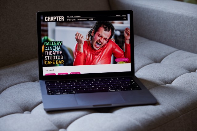
Chapter provides space for creativity in all its many forms. Art. Cinema. Theatre. Community. The stories unfolding in their centre, from their creative spaces to their café. They believe art is what you make it. That’s why they seek to nurture and embolden every artist, every creative, every curious mind.
Chapter needed a brand and website to represent the creative, diverse, community-centric work they do on both a local and international level. They wanted to stand out as an organisation that has something to say, to show, and to make people feel something. They also wanted to ensure they were as inclusive as possible to all communities in the area and much further afield.

“From world-class and emerging talent to the next generation, to our audiences and visitors. We’re here for all the things that bring us together, the things made to share, the things that make us.”
Brand strategy 🔗
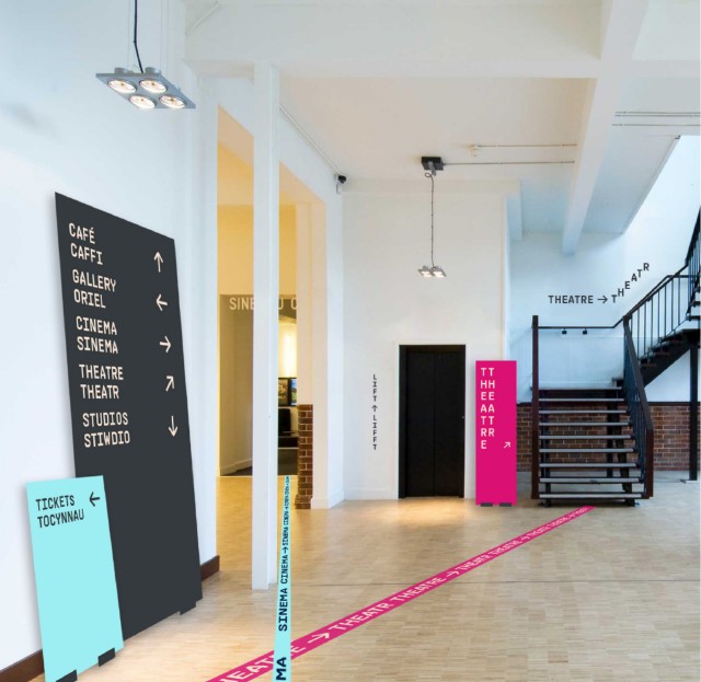
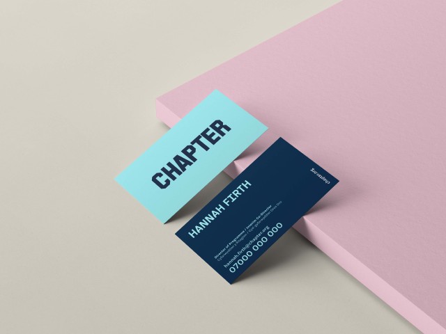
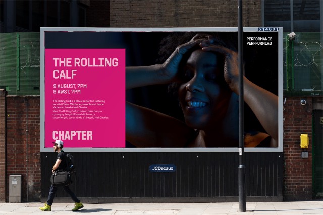
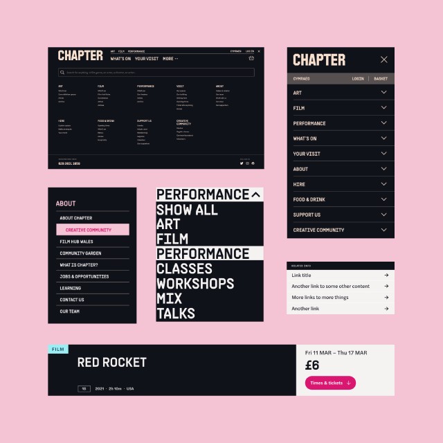
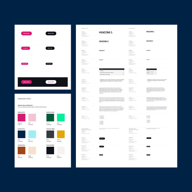
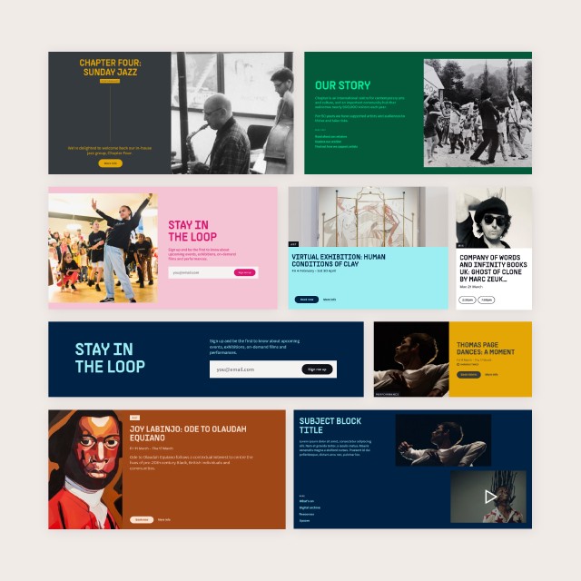
We created a brand strategy that developed a bold manifesto, values, and tone of voice. This enabled us to then create a full brand identity design language for use online, offline and in-venue. This included typography, iconography, colourways, digital and wayfinding signage, poster templates, and stationery.
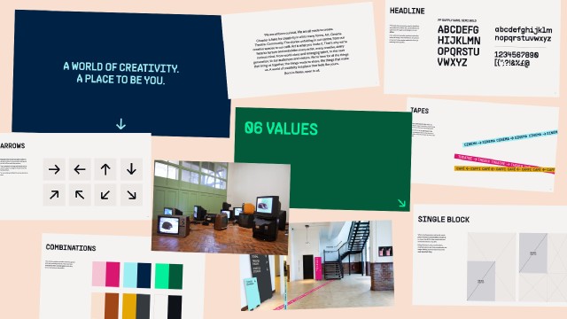
Brand identity 🔗
This new brand enabled the team at Chapter to have a strong and inspiring new identity to really represent all of the exciting work they live and breathe day-to-day at the arts centre.
User-centred design 🔗
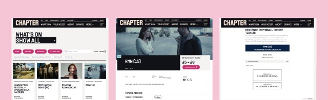
Alongside their rebrand, we crafted a new website for them. This website needed to show Chapter as more than just a cinema or cafe. It had to give equal weight to Chapter’s full offering which incorporates much more across art, performance, community, and creative spaces and studios. The emphasis had to be on inviting guests into the venue and clearly helping them to access all of the events, screenings, performances, and services they had available.
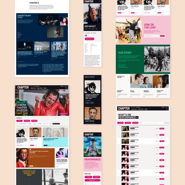
Booking system 🔗
We integrated Spektrix for ticket purchasing, membership management and donation collection. This enables Chapter to have a fully-functioning website which works extremely hard for them to promote and sell tickets and their other work.
We also focused on inclusivity and accessibility to ensure all patrons are welcomed to the venue both on and offline. Therefore this site is bilingual in both Welsh and English and all brand and digital work reflects complete parity of both languages to meet their users needs and requirements.