Marketing strategy, branding and user-centred website for UK charity focused on preventing young suicide.
Launch projectA brand and digital transformation to save young lives

Suicide is the biggest killer of people under 35 in the UK. Papyrus believes that many of those deaths are preventable. That belief is the foundation of everything they do.
Papyrus is the UK’s leading charity dedicated to the prevention of young suicide. Through their HopeLine 24/7 service, training programmes and national campaigning work, they support young people in crisis, the people who care about them, and the professionals who work with them every day.
Working with Papyrus is a reminder of why we do what we do.
Why Papyrus
“I've known people who’ve lost someone to suicide, and seen the lasting impact it has on them. Papyrus give young people hope, and the space to talk openly about how they're feeling. 24 hours a day.”

“To prevent suicide with urgent support, education, campaigns and conversations that keep young people safe – and hope alive.”
The challenge
When Papyrus first came to us, they wanted a new website. But what they actually needed was something much bigger.
As we got under the skin of the organisation, talking to staff, volunteers, people with lived experience, and the young people Papyrus exists to serve, it became clear that the real opportunity wasn’t just a digital redesign. It was a repositioning. Papyrus had a powerful mission and a deeply committed team, but an identity that didn’t match either. It felt dated, and crisis-led at a moment when the charity needed to step confidently into its role as a national force for hope and prevention.
We made the case for a full transformation. Papyrus said yes.

Discovery and organisational strategy
We began with an extensive discovery phase, running workshops with staff, volunteers, and people with lived experience of suicide and mental health crisis. We researched other organisations working in this field and sent detailed surveys to key stakeholders and users to better understand their views on Papyrus now and in the future.
Their voices shaped everything that followed. From the strategic direction to specific decisions about language, information architecture, and how content is structured for users who may be accessing the site at their most difficult moments. Every design decision, every word choice, every structural call was made with those users in mind.
This is what good discovery looks like. Routing through all of the information available, taking the feedback and truly listening to users. Not a box-ticking exercise before the real work begins, but the foundation on which everything else is built.


Brand identity
The old Papyrus identity felt flat and clinical. Muted colours and dated typography communicated crisis, not hope, and failed the people it was meant to inspire. Every visual decision we made pushed deliberately in the opposite direction.
The new colour palette is bold and full of life: vivid yellow and lime, rich aqua, deep purples, warm orange and energetic pinks, chosen to embody the Papyrus mission and speak to young people in a language they actually recognise. Typography brings character and energy to the brand: expressive, confident, warm. We developed an extensive suite of icons and imagery to represent Papyrus’ users accurately and authentically, so young people see themselves reflected back.
Applied consistently across resources, merchandise, print and the website, the identity holds together with confidence, a stronger platform for the conversations that matter most.


Tone of voice
The strategic and creative work began in the workshops. Through those conversations, we repositioned Papyrus from a crisis-led organisation to one defined by hope. That shift informed everything. We drafted a new strapline, ‘Here for Life’, and worked down through a refocused vision and mission, sharpening how Papyrus expresses its purpose. The foundations were solid before anything else was built. The tone of voice and messaging framework grew directly from that groundwork.
We built a framework that gives the Papyrus team the tools to communicate with young people in a way that is direct, human and supportive. That included detailed guidance on navigating the particular sensitivities of suicide and mental health language, which is a complex communication challenge in the charity sector. Content hierarchies, do’s and don’ts, and clear examples give the team the confidence to communicate consistently, whoever is writing.
Getting this right matters. For an organisation like Papyrus, the wrong word at the wrong moment can do harm. The right one can offer a glimmer of hope that can change the course of a young person’s life.


Internal communications and leadership support
A rebrand only works if the people delivering the mission feel genuine ownership over it.
We developed an internal communications strategy to help staff understand, adopt and champion the new brand. During a period of change and disruption, we also provided interim Marketing Director-level support, helping Papyrus maintain momentum and strategic clarity through to launch.
The kind of support that doesn’t always make it into a case study, but makes the difference between a launch that is successful and one that isn’t.

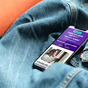
Website
The new website reflects the strength of the brand and serves each of Papyrus’ distinct audiences: young people in crisis, parents, carers and professionals.
Particular care was taken in how content is structured and presented. The page designs, user journeys and information architecture were built around one central question: what does someone need at the moment they arrive here? For a young person in distress, that means no overwhelming page layouts, no confusing navigation, no language that adds to their anxiety. It means finding help quickly, calmly, and without having to work for it.


“What began as a conversation about a new website became something much bigger – a full repositioning of how Papyrus presents itself to the world. Kind brought strategic focus, creative ambition and a genuine understanding of what's at stake if we get this wrong. I’m proud of what we've created together.”