Brand strategy, identity, tone of voice, guidance and design
A brand that offers hope for everyone
By Pamela Holmes, Brand Lead

The old Papyrus identity didn’t reflect the organisation Papyrus had become, or the young people they were trying to reach. It felt medical, muted and cautious. Understandable, perhaps, given the sensitivity of the subject matter, but counterproductive. Young people don’t respond to the language of medical brochures. They respond to something that feels alive, honest, and real. Our job was to build that.
A brand built around hope
The strategic decision that underpinned everything was a shift in positioning: away from crisis and toward hope and prevention. Papyrus had always believed that many young deaths by suicide are preventable. The new brand needed to make that belief visible.
That single shift changed every creative decision we made.
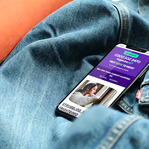
Colour. The previous palette was exactly what you’d expect from a charity operating in this space: safe, quiet, sensitive. We replaced it with something bold and full of life. Rich aquas and deep purples lead the identity, grounded and confident, with vivid oranges, energetic pinks and hints of yellow bringing warmth and energy as supporting tones. Not chosen for their vibrancy alone, but because they embody the mission. Life is worth living. Help exists. You matter. Here for life. The palette had to say all of that before a single word was read.
Typography. We sourced a typeface with genuine character and warmth: expressive, confident, human. Additional glyph characters add personality and a sense of distinctiveness, while a range of widths, from condensed through regular to super wide, give the brand real expressive range, allowing messaging to flex visually across formats and contexts. The typography needed to work hard, carrying the directness of the message while remaining approachable to a young person who might be reading it in a very difficult moment. Big, generous headlines that hold space. Hierarchy that guides rather than overwhelms.
Icons and imagery. This is where representation became critical. The old visual language was generic in a way that distanced rather than connected. We crafted a bespoke suite of hand-drawn icons, deliberately designed to appear perfectly imperfect, bringing an authentic, human quality that no stock library could replicate. The new icons and imagery were developed to reflect the young people Papyrus exists for: in the moments, settings and situations that are real to them. For a young person arriving at the Papyrus website in crisis, seeing themselves reflected back is part of what makes the experience feel safe. It signals: this place is for you. You belong here.


“Colour, type and imagery are never just aesthetic choices. For Papyrus, every visual decision was about trust: making a young person feel that this organisation understands them, is on their side, and is worth reaching out to. Getting that right mattered more than anything else.”
Tone of voice
Visual identity and tone of voice have to work together, one without the other is always incomplete. For Papyrus, the language challenge was particularly complex. How do you speak to a young person in crisis with warmth and directness, without either softening the reality of their situation or adding to their distress?
We started with the foundations. A new strapline, brand vision, manifesto and values, built to reflect the organisation Papyrus had become and to anchor everything that followed. From there, we developed a tone of voice framework that gives the Papyrus team real tools, not just principles. That meant content hierarchies that show how to structure information for different audiences, clear do’s and don’ts, and specific guidance on navigating the particular sensitivities of suicide and mental health language. The wrong word in this context can cause serious harm. Getting the language right matters enormously.
The framework serves five distinct audiences: young people in crisis, people worried about someone, parents and carers, professionals, and supporters. Each group needs something different from Papyrus, and the tone of voice system needed to be flexible enough to meet all four while remaining unmistakably the same brand. Extensive guidance was crafted to equip the Papyrus communications team to deliver this confidently in their day-to-day work, across every channel and context.


Brand guidance
A brand is only as useful as the people applying it. The most beautiful identity in the world is wasted if the in-house team can’t use it confidently, consistently, and without reaching back to the agency every time they create something new.
We built extensive and detailed brand guidelines designed to be genuinely useful to the Papyrus team day-to-day: clear, practical, and grounded in real examples. A working reference that makes good brand decisions feel straightforward.


Brand launch strategy
Building the brand was one challenge. Getting it in front of the right people, in the right way, at the right moment was another and one that deserved just as much thought.
Charities rarely have the luxury of a single, fixed launch budget. The reality is that what’s available can change quickly, and a launch strategy that only works at one funding level isn’t much of a strategy at all. So we built ours to flex. We mapped out a range of launch scenarios from a low-cost approach grounded in organic activity and earned media, through to a fuller video campaign with paid amplification, PR support and event-led moments - so that whatever resource Papyrus had available at the point of launch, there was a clear and considered plan to execute.
At every level, the strategic thinking was the same: lead with the mission, centre the people Papyrus exists for, and make the new brand feel like a moment of genuine forward movement rather than a cosmetic refresh. The awareness activity was mapped across channels and audiences, with different tactics calibrated for young people, professionals, supporters and media because reaching a journalist requires a different approach to reaching a school counsellor, and both require something different again from reaching a young person on tiktok.
The tiered approach also gave the Papyrus team something genuinely useful for future planning: a document they could return to and build on, rather than a one-time launch checklist. Brand awareness is something you build consistently over time, and the strategy was designed with that in mind.


Design production: resources and merchandise
The brand came to life across a wide range of designed materials: training resources, printed guides, campaign collateral, merchandise and more. Each piece of production work was an opportunity to prove the identity in the real world, to test whether the palette, the typography and the visual language held up outside of a guidelines document.
They did. Seeing the brand applied across physical and digital materials, consistently and confidently, confirmed that what we’d built had genuine range. The identity could flex across contexts without losing itself. That’s what a strong brand does.
To make sure that range could be maintained long term, we supported the Papyrus team with hands-on guidance and training in professional design software, equipping them to edit existing brand resources and create new ones independently, without compromising the integrity of the identity.


What this project means to me
I’ve worked in brand for a long time, and I believe deeply that a good brand can change how an organisation connects with the people it exists to serve. With Papyrus, that belief felt more urgent than usual. This wasn’t about market differentiation or standing out in a crowded sector. It was about making sure that a young person in crisis could find Papyrus, trust Papyrus, and feel that Papyrus understood them.